
I hear this a lot “no-one buys from my website, they buy from exhibitions”. There’s the feeling that people come to your website and just noodle around. “Ooh, that’s nice.” But never buy anything.
The problem is the psychological frame
I think for many artists websites it just never occurs to the visitors they could buy the work. They are in the frame of mind that they are looking .. like if you buy a book on, I don’t know, Picasso. You’re getting to know the artist’s work, you’re not out to buy a Picasso.
On a website, you’re expecting to see the artist’s best work, much of which may be long since sold.
(I was rather taken by David Bailey saying he hoped one day to take a good photograph. He was basically saying you should only show your very, very, very best work. If your website visitors are expecting this, they are not expecting to be able to buy anything.)
So that’s the frame of mind people are in.
A little red dot can change that
You know what that means. Anyone who buys art knows what that means.
To the visitor, it means you can buy stuff. And it means if you don’t buy it, someone else might.
A lot of buyer behaviour is driven by the subconscious.
If we can add a red dot to the sold works on your website, we can change the state of mind of your visitors. Switch them over into “oh, well, we really like this one and it’s not sold”.
Yes, I’m literally talking about adding a red dot underneath any artwork on your website that is sold. And if your layout is tiled, we can put it over the bottom corner. You get to control the colour, the size and the position.
And if you change your mind, it’s removable.
It’s just a small step, but it could make a huge difference. You may say “err, well, they don’t buy because I haven’t got a buy button”. Fine, but setting up e-commerce is a big old faff. Loads of work. Headache decisions (tax, worldwide shipping). Expensive. This is dead simple, and it’s enough to prompt people to contact you.
First one to ask gets it done, for free
I think it’s going to be fairly easy to do. So I’m going to make you an offer.
If you are an artist and you want me to add a ‘sold’ red dot to your website for free, get in touch. If yours is built on a common platform and you’re the first to ask and if you’re willing to give me a login, I’ll do it and put up here how I did it (while protecting your security of course). So then, if your website is built using say WordPress or WIX, anyone else reading this article will be able to just follow the instructions and do it themselves.
So if you want that, email me at john@johnallsopp.co.uk (WordPress is taken, come back for instructions in a few days.)
I should say that all I would be doing is adding some code to the stylesheet, which covers how things look. In other words, if you discover something’s functionally broken when you go back to look at it, it won’t be down to me. Given I’m working for free, and that anything like that really won’t be my fault, I have to say here that I won’t accept any liability for any losses due to changes I’ve made.
Here’s how I did it in WordPress
1/5 log in with sufficient privileges
OK, first of all you’ll need a login to your website. There are levels of login, so if you have a web developer, they may only have given you enough privileges to write content, but not to change the look and feel of your website, so if you are not seeing the options I’m talking about here, that might be the problem and so either ask your web developer to do it or you’ll need to ask for your account to be given admin privileges.
Alright, so assuming you are logged in .. the artist I did this for is simply blogging and uploading images directly to that blog. That’s not the best way to do it, to be honest, but that’s how I’ve tackled it here.
The best way is to load your images to the media library, and then into your blog. That way you can re-use the same image in other parts of your website, maybe make an image carousel here, and a page of your best works there, and when a piece is sold, you just have to mark it once, you don’t have to trawl through your website wondering where else you uploaded it.
If you are doing it that way and would like me to see how this is done in that case, I’m happy to, just get in touch.
A lot of things can be different in WordPress depending on the theme you’re using, but this example seems to be relatively vanilla, and using WordPress’ Gutenberg editor which is included with the latest version, so this is a great artists’ website to start with.
2/5 tag an image with ‘sold’
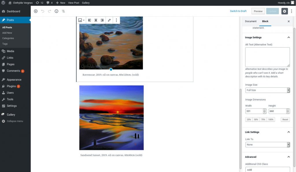
Here, we’ve selected a blog post containing an image, clicked to edit it, and clicked the image we want to mark as sold.
At the bottom right, can you see under Advanced we can add an Additional CSS Class, and in there, I’ve typed ‘sold’.
Don’t forget to Update to save your change.
CSS controls how things look on the web.
OK, so that’s basically how you mark up any work that’s sold, so add to your to-do list to go through your website and mark up all the sold works.
Now all we have to do is add the red dot.
3/5 create how your red dot is going to look
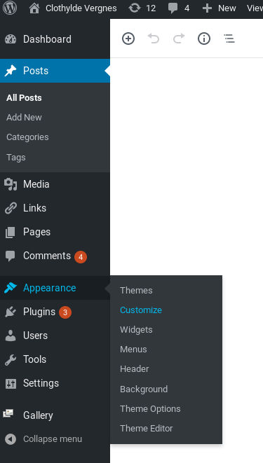
On the left, hover over Appearance, choose Customize and then when all of that loads up, at the bottom left choose Additional CSS.

Don’t use this, I’ll give you the code in a minute, but I started with this:
.sold figcaption:after{
content:’\2022′;
padding:0px;
font-size: 20px;
color: red;
line-height: 1em;
display: inline-block !important;
}
I’ll break it down so you know how to customise it to suit yourself.
.sold says “apply this to the items we’ve marked ‘sold'”.
figcaption:after says “apply this after the figcaption for the items that you marked as sold”.
All the style instructions are contained within { }, and all the commands are like to what colon do this semicolon. You have to get that exactly right or none of it will work.
Alright, so content:’\2022′; gives us the dot. I know. Whatever.
padding:0px; says there’s no space around it. You can add however much space you want, the px is pixels. 10px, say. Try it. You can do different padding-top, padding-bottom, padding-left and padding-right.
font-size: 20px; .. so that’s the size of the dot. Change the 20 to make it bigger or smaller.
color: red; .. note American spelling. You can use rgb colours like #ff0022; so you can make the red a little more subtle if you prefer.
line-height: 1em; so that’s the line height, mebbe mess with that. em is .. 1 em is one character height. So 2em is like double spaced. You can do 1.5em or whatever. Actually this line might be redundant.
display: inline-block !important; this says “display the dot as part of the paragraph, not in a paragraph all on its own. !important is bad practice, to be honest, but it forces the system not to override this command.
So the feedback from the artist after I did that was “Maybe should be bigger? position, maybe in front of text, not after text?”
In front is a really good call because in one image, the dot wrapped onto the next line, so I’m glad they said that. So that’s easy, I can just change figcaption:after to figcaption:before.
The size, let’s just change it from font-size: 20px; to font-size: 30px; and see how that suits.
So then, click publish and go see how it looks on the image you marked as sold.
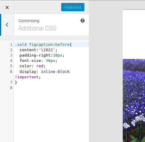
I tweaked it a little, and ended up with this, you can copy and paste and use it yourself:
.sold figcaption:before{
content:’\2022′;
padding-right:10px;
font-size: 30px;
color: red;
display: inline-block !important;
}
4/5 check the red dot is displaying for the image that you marked as sold
Now, this is only going to work for you if you have a figcaption, let me know how you get on and I’ll try to make this as universal as I can. I posted these instructions on 10 August 2019 so if I link to http://www.clothylde.com (she gave me permission) and you check it soon, she won’t have had chance to roll it out, but you can see the red dot on her post from 29 July 2019.
Personally, I would like to see that dot lined up better with the text, but I wasn’t quite able to get that to happen. Maybe one day a CSS specialist will hop by and share their knowledge.
5/5 go through all your sold images and mark them as sold
When the CSS part is done, you only have to set that up once. Now all you have to do is that step 2 above, mark each sold painting as sold.
And if ever you want to change how your red dot looks, you can tweak your CSS and it will roll out across your whole website.
Try it, let me know how you get on. If it works, let me know and it’ll put a skip in my step. If it doesn’t work for you I can try to help if you would like me to.
The Media Library
It would be better if we could tag images in the WordPress media library so then every time they are used we don’t have to tag them sold each time. That doesn’t seem to be how WordPress does it tho, so that’s presently unresolved, if you’d like me to look at it, yell.
This is better than sold/unsold pages
One other thing. Of course, you could have a ‘sold works’ page, and a ‘for sale’ page. But wouldn’t you rather arrange things into their natural themes? Here’s my blue period. Here are my landscapes. Here are my paintings of squirrels. And within those pages, show what’s been sold. If you lump sold in one place and unsold in another, it doesn’t allow for an easy feeling of what percentage are sold, whereas if the visitor is interested in your blue period paintings and at a glance they can see there are only a few left, that’s much better.
By the way, everyone nowadays receives multiple emails every day offering to sort out your SEO. I get it. You’re welcome to read the about-me page and follow me on social media and so on and you’ll see I’m an OK kinda guy.
